Liminality
2020 has been a unique time in most of our lives, as we find ourselves inhabiting a new normal, rethinking our methods of interaction and how we exist in spaces around others. Personally, 2020 holds significance for me as the year I decided to finalize my career transition, and go back to graduate school to pursue a Master of Fine Arts degree in Graphic Design. The catalyst for this project is considering the liminality of this year, and what liminality means to me.
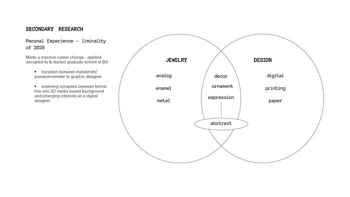
Considering these questions took me in several directions, most meaningful being that I was creating new synapses between my previous education and my new education, and learning to adapt prior knowledge to this new space. As a metalsmith, I used enamel to create color, depth and form, building dimensionality through the processes of layering materials and color. I am acutely aware of the similarities between metalsmithing and graphic design, namely that certain softwares allow us as designers to mimic the properties of the real world through manipulating form in 3D digital space. The goal of this project is to visually represent how I am growing within this transitional space by exploring these similarities.
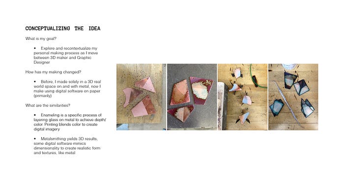
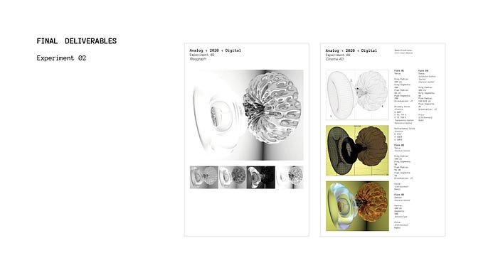
I asked myself three main questions: what is my goal for the project? How has my making changed? And what are the similarities between making as a metalsmith and as a graphic designer? By exploring these questions, I constructed a project that would allow me to dig into these themes and represent my transitional space through a new mode of making. The final concept was the create a series of abstracted forms in Cinema 4D, and to formulate and apply realistic colors, textures and transparencies to bring dimension and realism. I created a specification sheet for each design to concisely depict how each form was made, colors were applied and how they were digitally manipulated. The goal of the spec sheet is to mirror my process of design as a metalsmith in carefully documenting my process to ensure continuity in production.The final output is a series of Risograph prints of each final piece as well as variations exploring color options.
Why Cinema4D?
I chose this software because it has the capacity to create ultra realistic, three-dimensional forms and allows the user to apply ultra realistic material textures that mimic the materiality of the real world. This process re-contextualizes my pre-graphic design aesthetic of organic and abstract form making with detailed process notes via the spec sheets.
Why Risograph Printing?
The Risograph prints ink in layers to bring depth to imagery. This references the process of layering enamels to achieve the same effect. This method allows me to conceptualize new visuals that mirror my previous work, building bridges between my old and new methodologies.
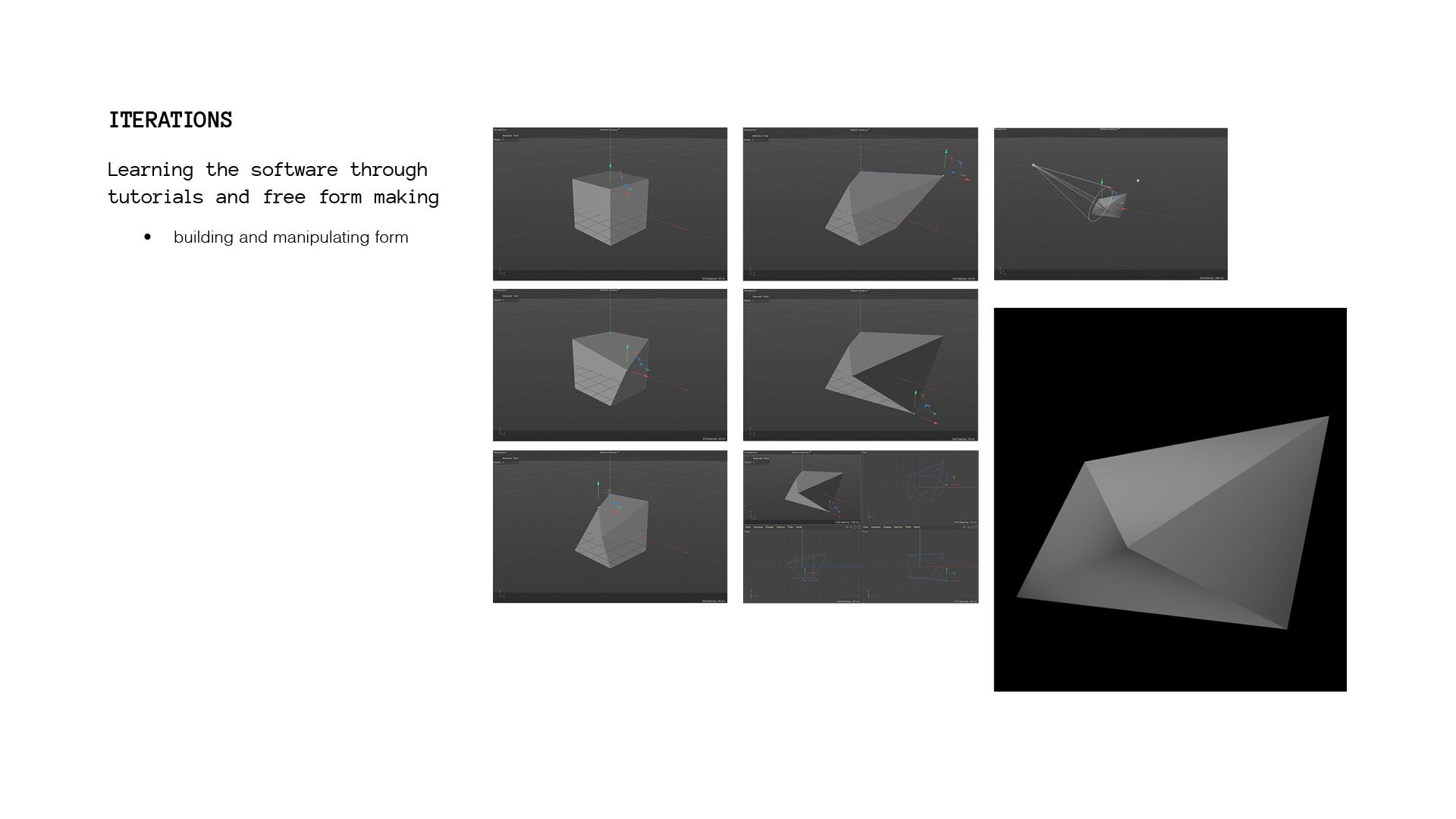
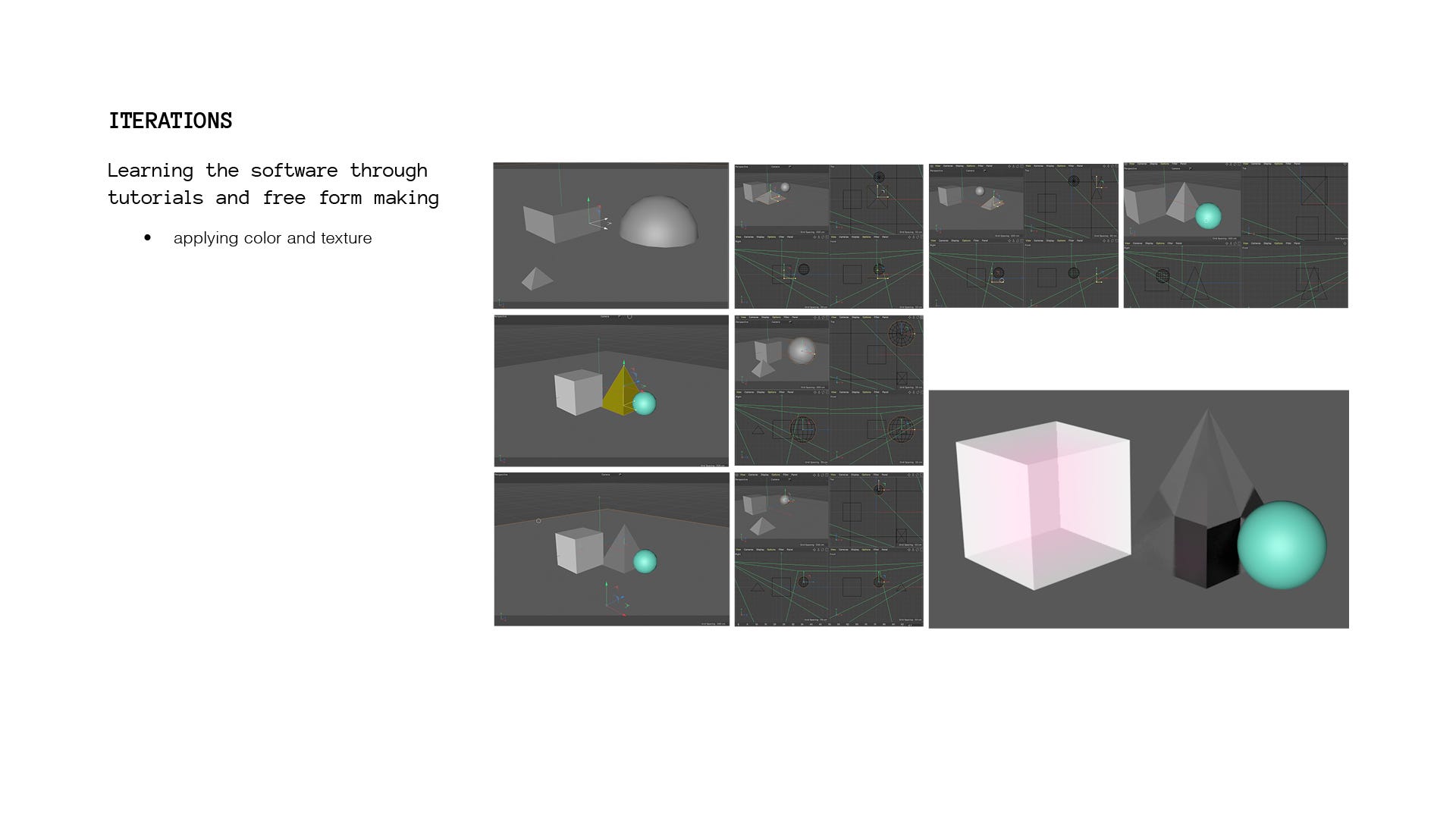

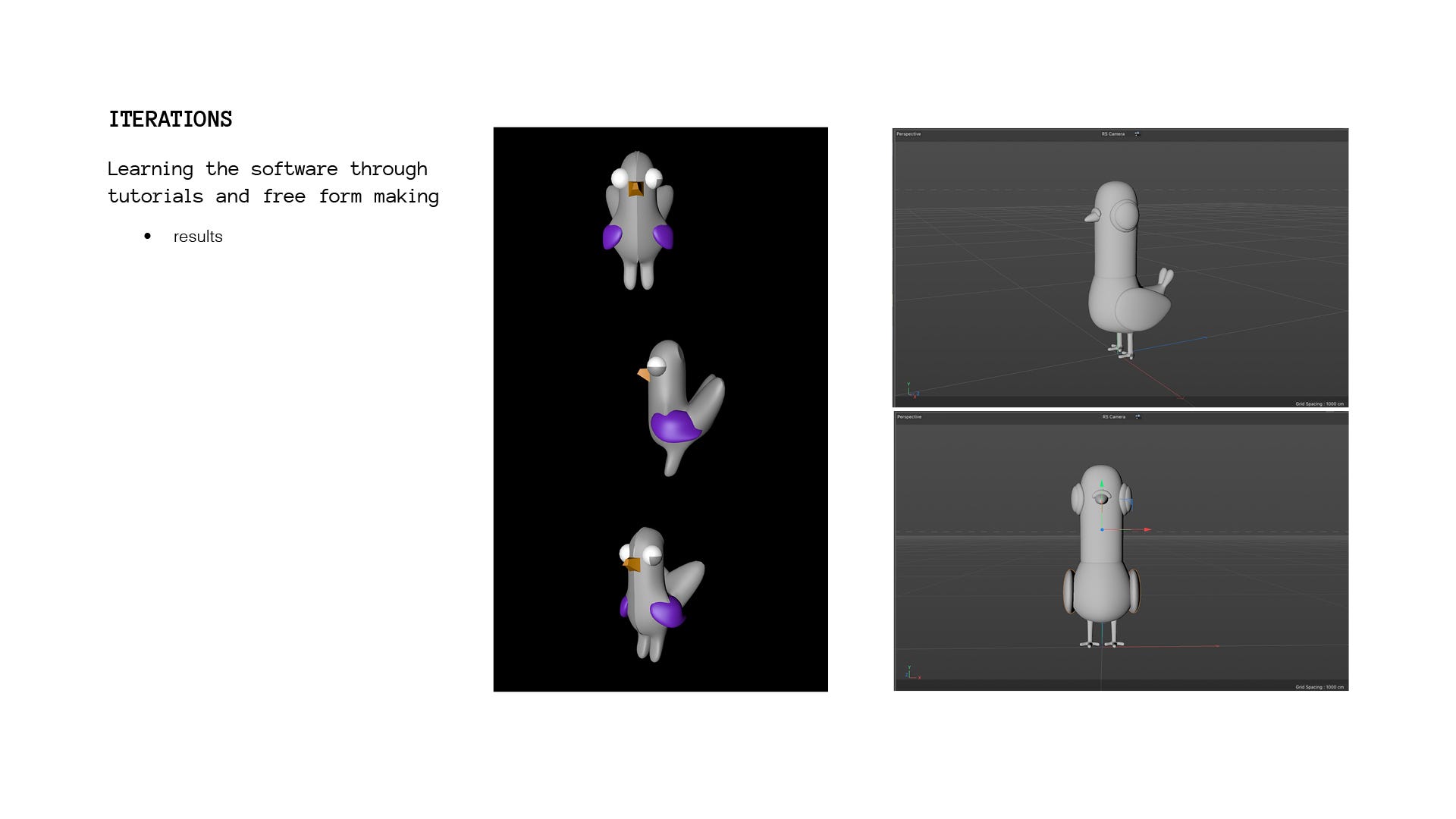
This series of images showcased my working process for learning the software. Using tutorials and free form making, I gradually built confidence in this new software to design forms, but not without a significant learning curve, evident in the unfortunate looking pigeon on the bottom right!
Once I felt confident in my capacity to create, I began planning final pieces to execute. I wanted to create forms with colors and textures that mirrored the effects of enamel through their transparencies and metallic applications. When the forms


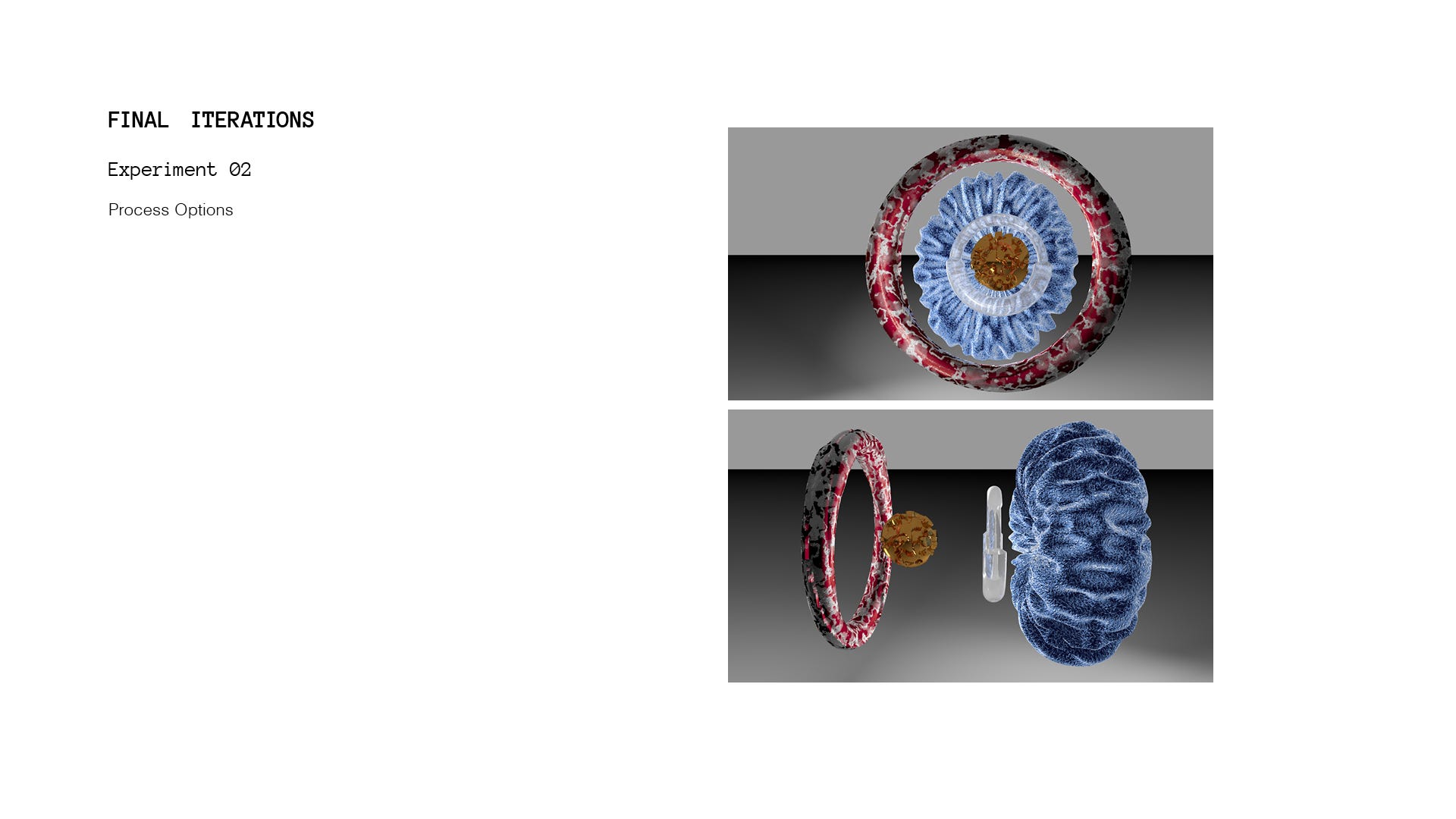
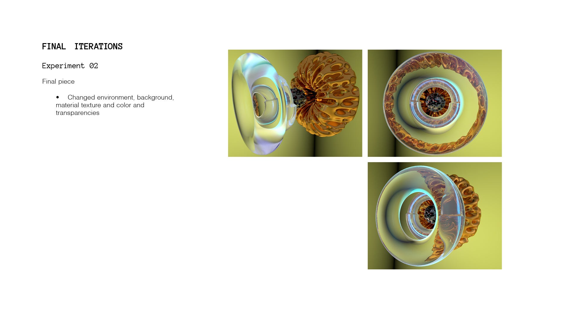
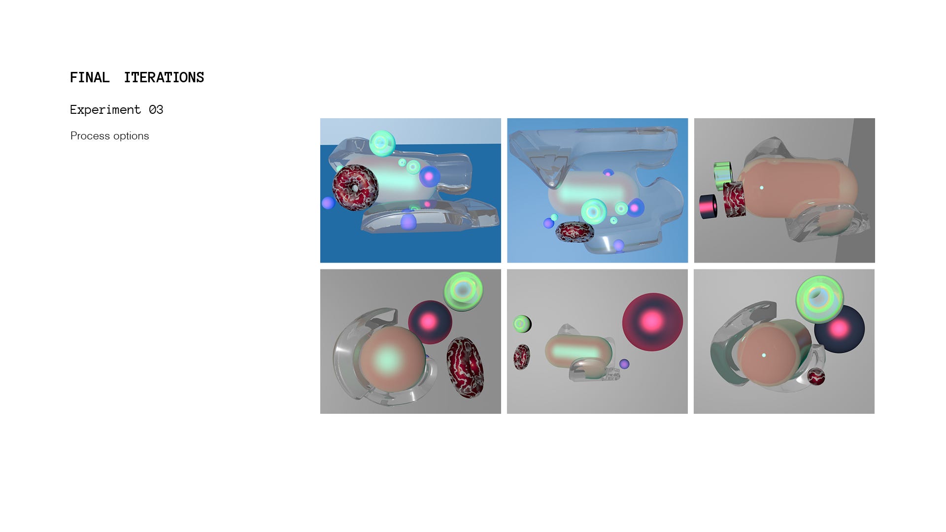
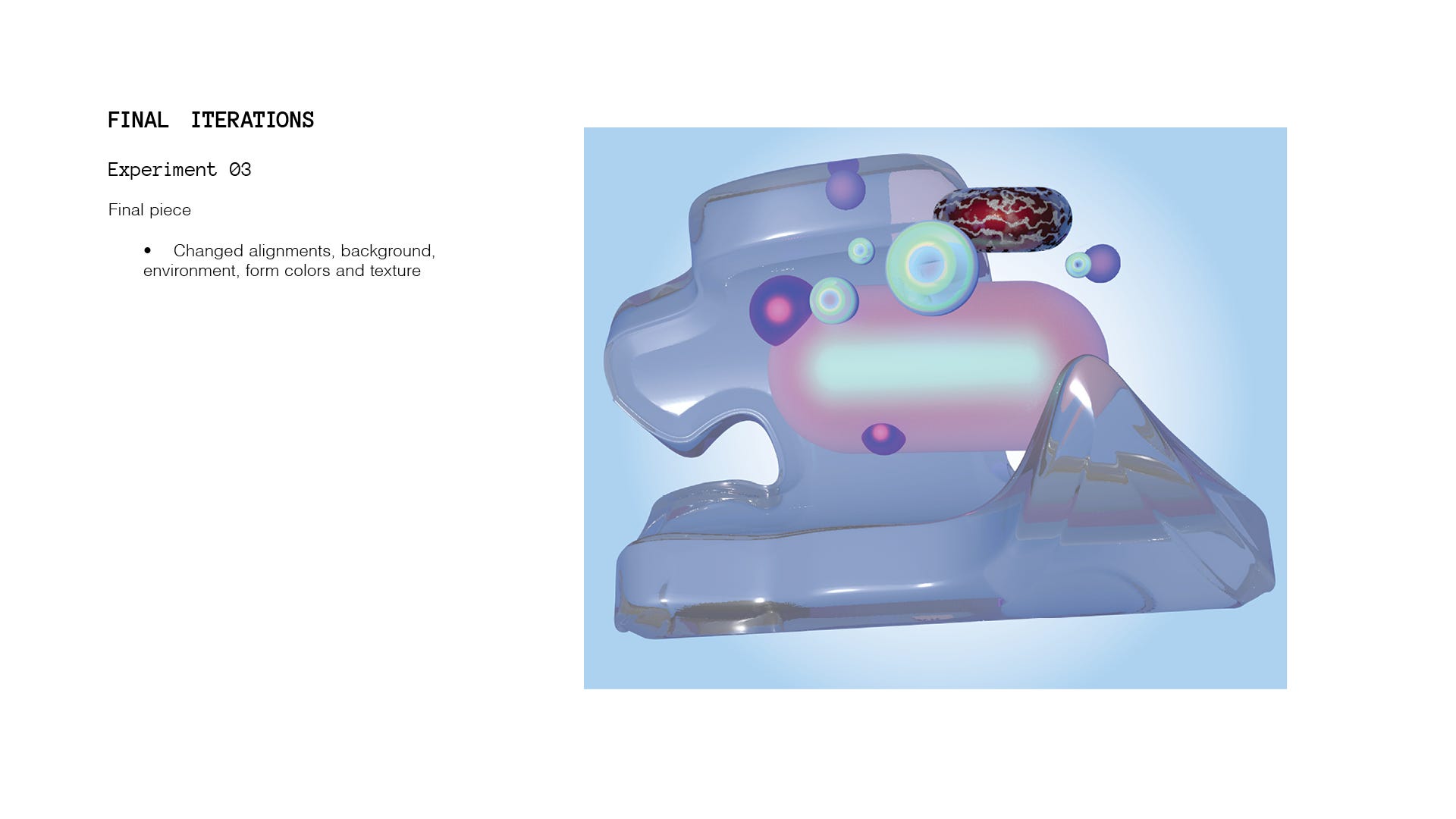
Through a series of iterations I created three final forms that I felt effective captured the visuals I wanted to convey, and worked to create the final outputs.
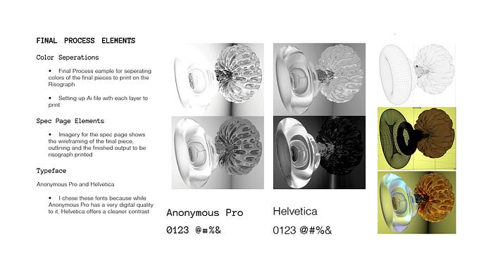
This is where I learned what a TIF file was! This let me export each piece in a higher quality for photo use which helped bring a crispness to them. In Photoshop, I separated the colors to their CMYK elements to use on the Risograph, and separated each piece into their wireframes and outlines as well as the finished image.
The final layout above shows a clear spec sheet for recreating each form, as well as its color and digital manipulations. The color separations for printing are seen on the left.

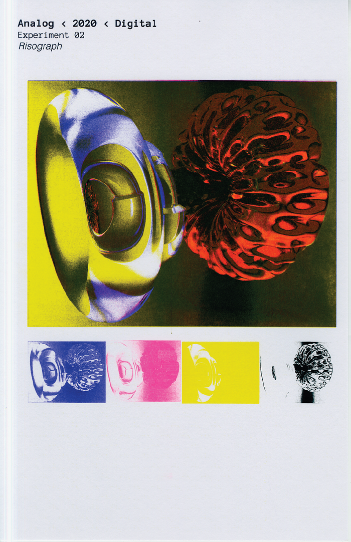

The final outputs for each piece as printed on the Risograph allowed me to explore the layer building process through ink as opposed to enamel, speaking directly to my personal space between two forms of making. From these three, I chose two to create variants on, in order to explore color application.


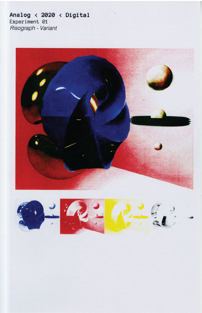

Through the final output of Risograph Prints, Variants and Spec Sheets, I have visualized the liminality of my experience between metalsmith and graphic designer by exploring new methods that bridge the space between the two disciplines.
